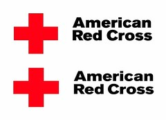
One of these things is not like the other.
 Can you tell the difference between these two logos?
No? Well, stay tuned for the answer at the end of this post.
As Lise mentioned, National has just come out with a new set of brand standards for us to use. And while they may seem like small changes (for instance, you may or may not have noticed that we changed the shades of gray and red on this blog and switched our font to Georgia), they’ll make a big difference in creating a consistent look for all Red Cross materials. Kind of like in the movies, when they have to make sure that the actor is wearing the same exact outfit in all of the scenes. (Was he wearing the shirt with the stain on the right shoulder in the last scene? Well, we better make sure he’s wearing that same stained shirt in this scene!) You probably don’t even notice the actor’s outfit, but if it all of a sudden changed from one scene to the next you certainly would!
And so here’s some brand standards trivia for you.
Inspired by Mental Floss Magazine‘s “Six Degrees of Ken Jennings” in which Jeopardy! genius Ken Jennings links two unrelated ideas (for example, “Lent” and “Lint”) in just six steps, I will now link “typeface” and “furry face” in only six short steps.
1. Our new standard typefaces are Georgia and Akzidenz-Grotesk. While the name Akzidenz-Grotesk may sound appalling at first (Grotesque accident? Oh no!), in German “akzidenz” means something like “standard” and “grotesk” means “sans serif” (or in plain language, without those little hangy feet thingies on the tips of the letters). Akzidenz-Grotesk was created at a German type foundry in the 1850’s and was later used as an inspiration for another commonly used typeface, Helvetica.
2. Helvetica (orginally named Neue Haas Grotesk) was created at the Haas type foundry in Switzerland. (Helvetica actually means “Swiss.”)
3. Switzerland is, of course, where the International Committee of the Red Cross (ICRC) was founded in 1863. The inspiration from the Red Cross flag was also taken from the Swiss flag. While the Swiss flag is a white Greek cross on a red background, the Red Cross flag is a red Greek cross on a white background.
4. A Greek cross is “a cross having an upright and a transverse shaft equal in length and intersecting at their middles.” It has had many uses throughout history. One of the original uses was as a symbol of the four compass directions.
5. A compass is an essential item to have in your disaster kit! Learn more about this and other essential survival items by taking our new Wilderness Survival course.
6. And speaking of wilderness survival, one of our heroes at our Breakfast of Champions helped her companions stay warm and safe when they were stuck in the wilderness. Her name is Velvet, and she is a black lab/German shepherd mix.
So our furry-faced hero Velvet is also, in a round-about way, from Germany. Just like our typeface Akidenz-Grotesk!
Hope you enjoyed the trivia.
Oh, and the answer to the logo question is just that it’s a slight difference in weight and letter spacing.