There’s a map for that.
Man, I love infographics. You can throw a thousand stats at me and they just won’t make sense until I see it laid out on a good map or chart.
I bet you’re the same way. So I’m glad to share with you a couple of recently created disaster-related maps that may help you 1.) understand disaster risk and response, and 2.) appreciate our mild Oregon weather even more.
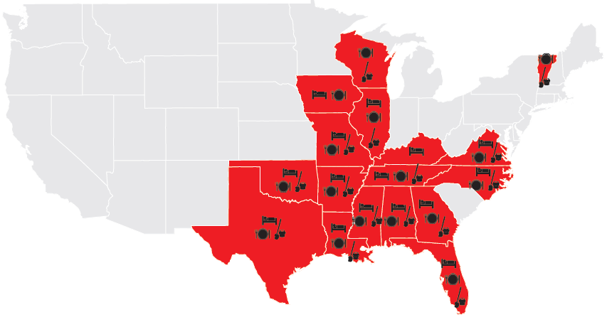
This first map shows all the states where the Red Cross has been providing food, shelter and supplies recently. (Large version with legend here.) Stunning, isn’t it? Spring storms have been rough on a lot of people this year.
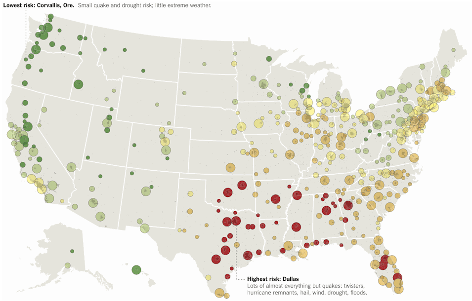
Speaking of weather, we’ve got it pretty good here in Oregon. Just how good? Well, according to the New York Times, Corvallis, Oregon has the least disaster risk of any place in the country. Of course, everything is relative. We may not have frequent storms in Oregon, but we all know that a mega-quake is in Pacific Northwest’s future.
And finally, speaking of maps… You have downloaded the Red Cross Shelter app, haven’t you? That’s where you’ll find a map of the latest shelter locations. Download it now so you’ll have it if/when you need it.